Enhanced Digital Experience for Leading Fiber Cable Brand
A comprehensive website overhaul featuring modern design principles, improved navigation architecture, and enhanced product showcase functionality for better customer engagement and lead generation.
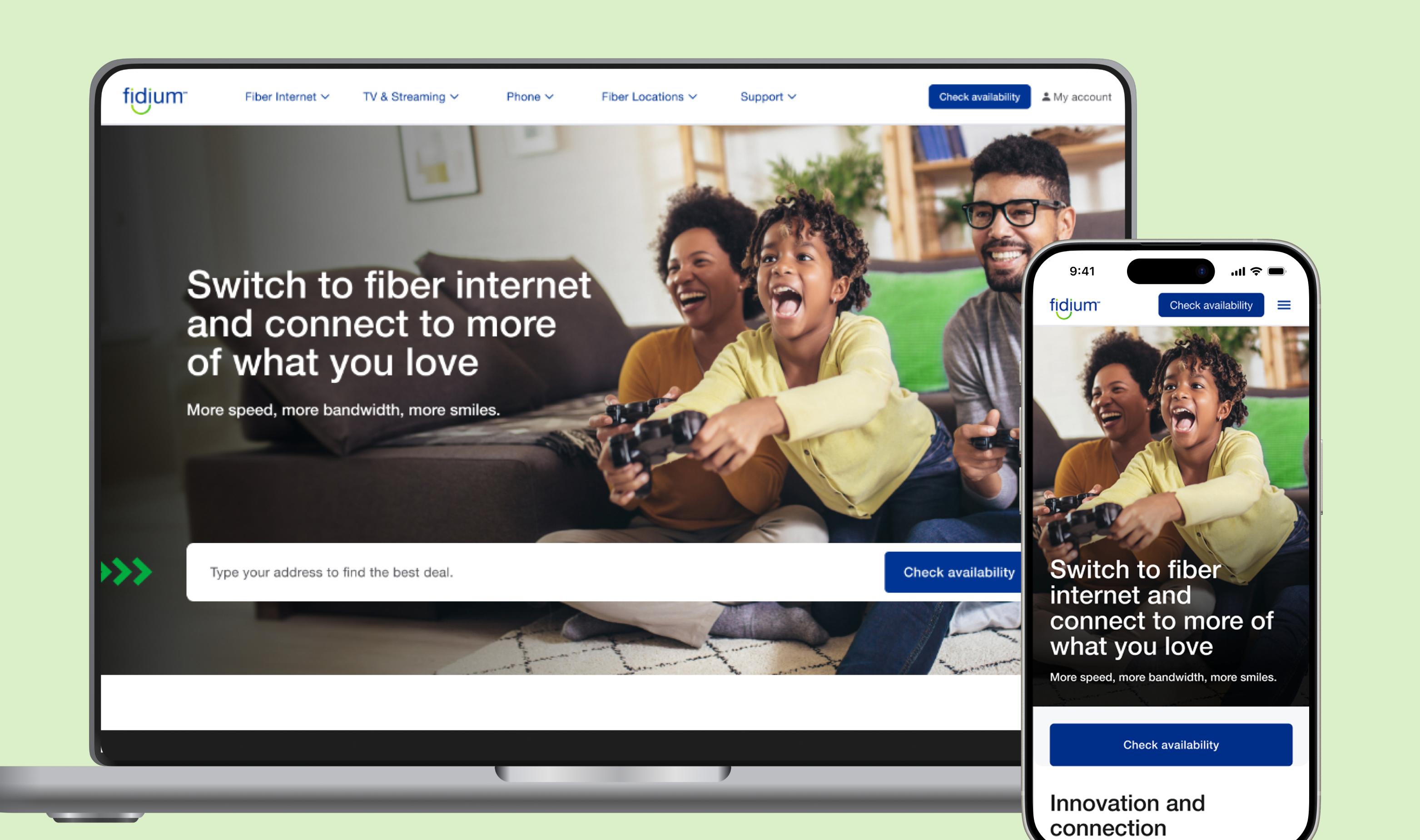
Context
Fidium is a fast-growing fiber internet provider delivering high-speed connectivity and digital services to homes and small businesses. As a customer-centric company, Fidium relies on intuitive digital experiences to communicate service offerings, support subscribers, and drive ongoing engagement.
Fidium’s key landing pages lacked clarity and usability, making it hard for customers to find plan details, manage services, or stay engaged. The redesign focused on improving structure and content across four core pages to better support user needs and drive engagement.
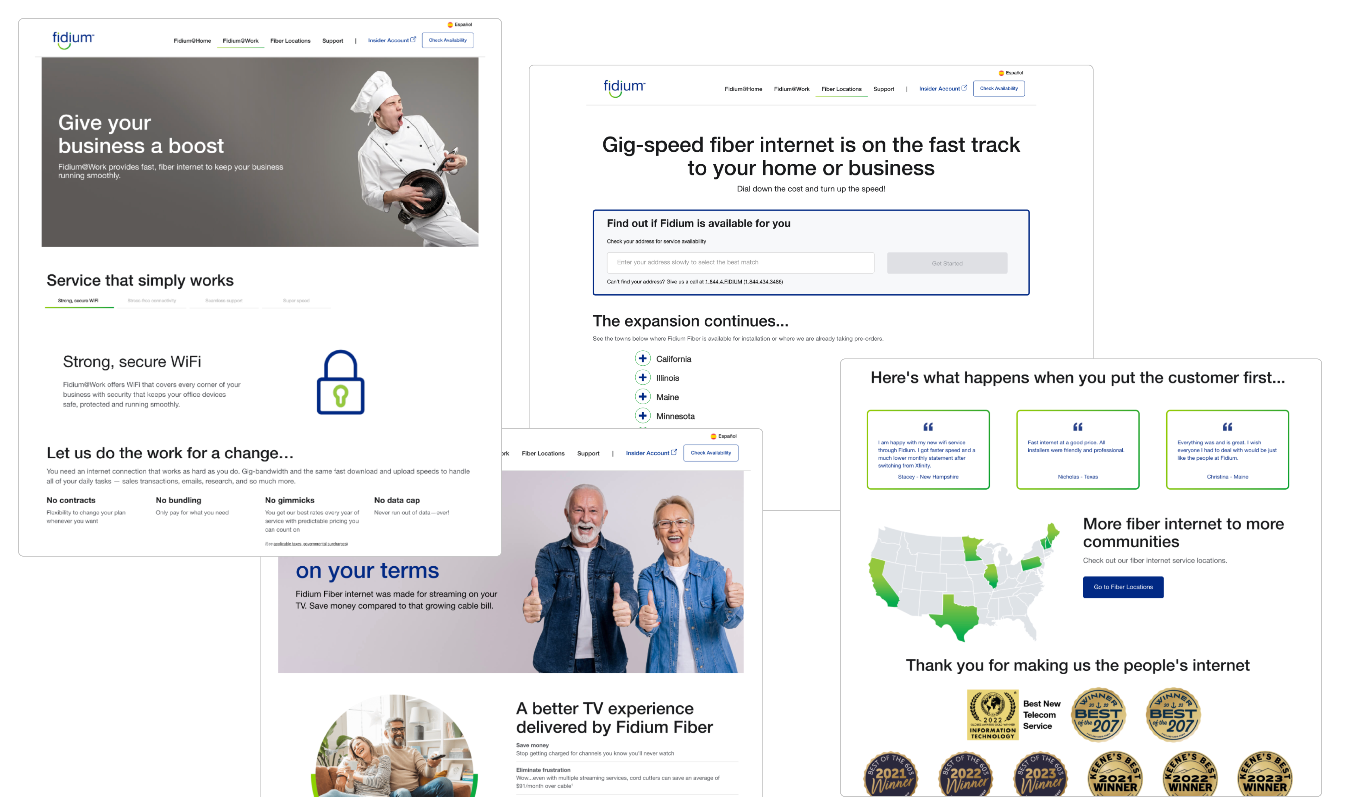
Existing website
Solution
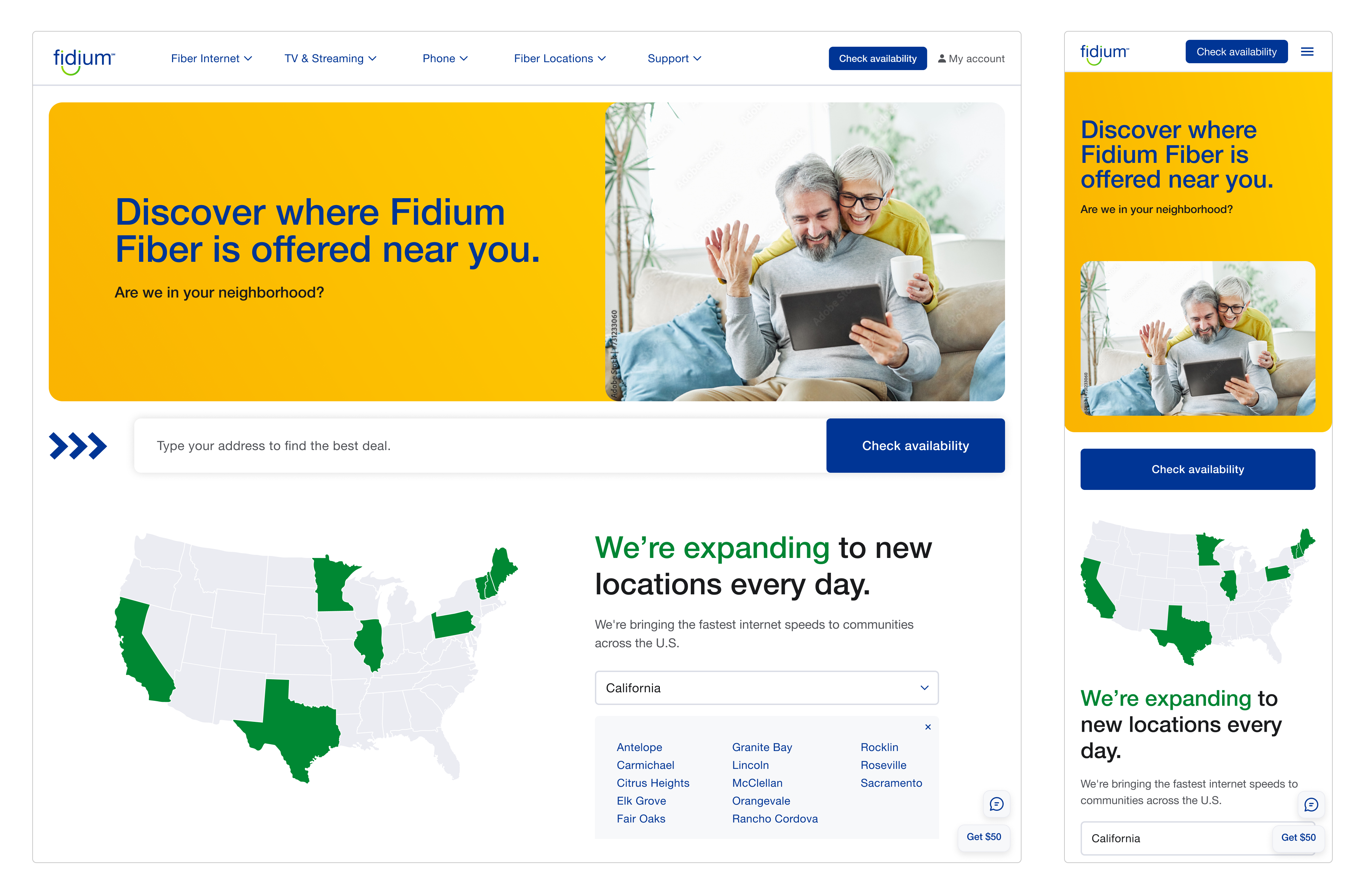
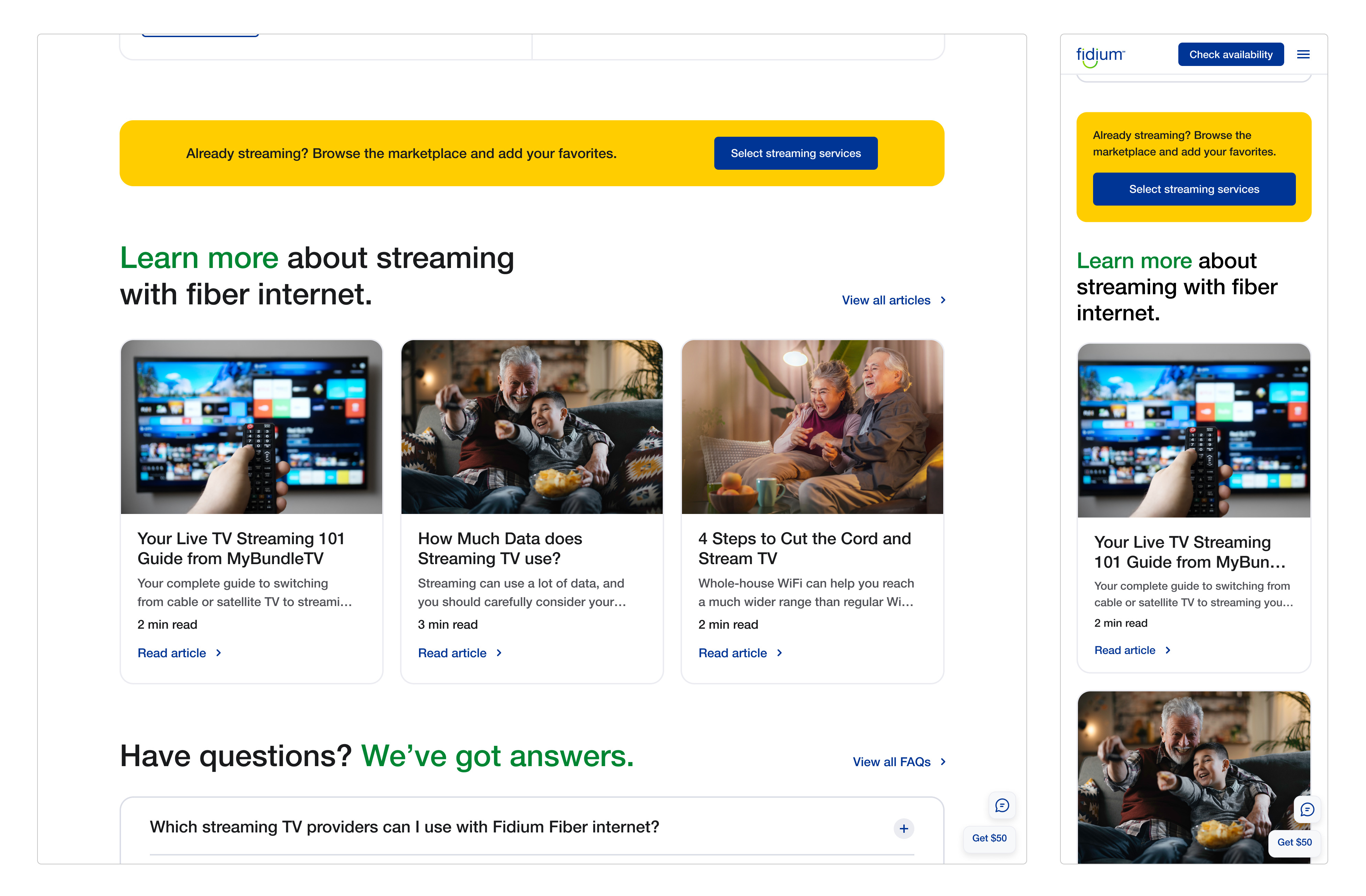
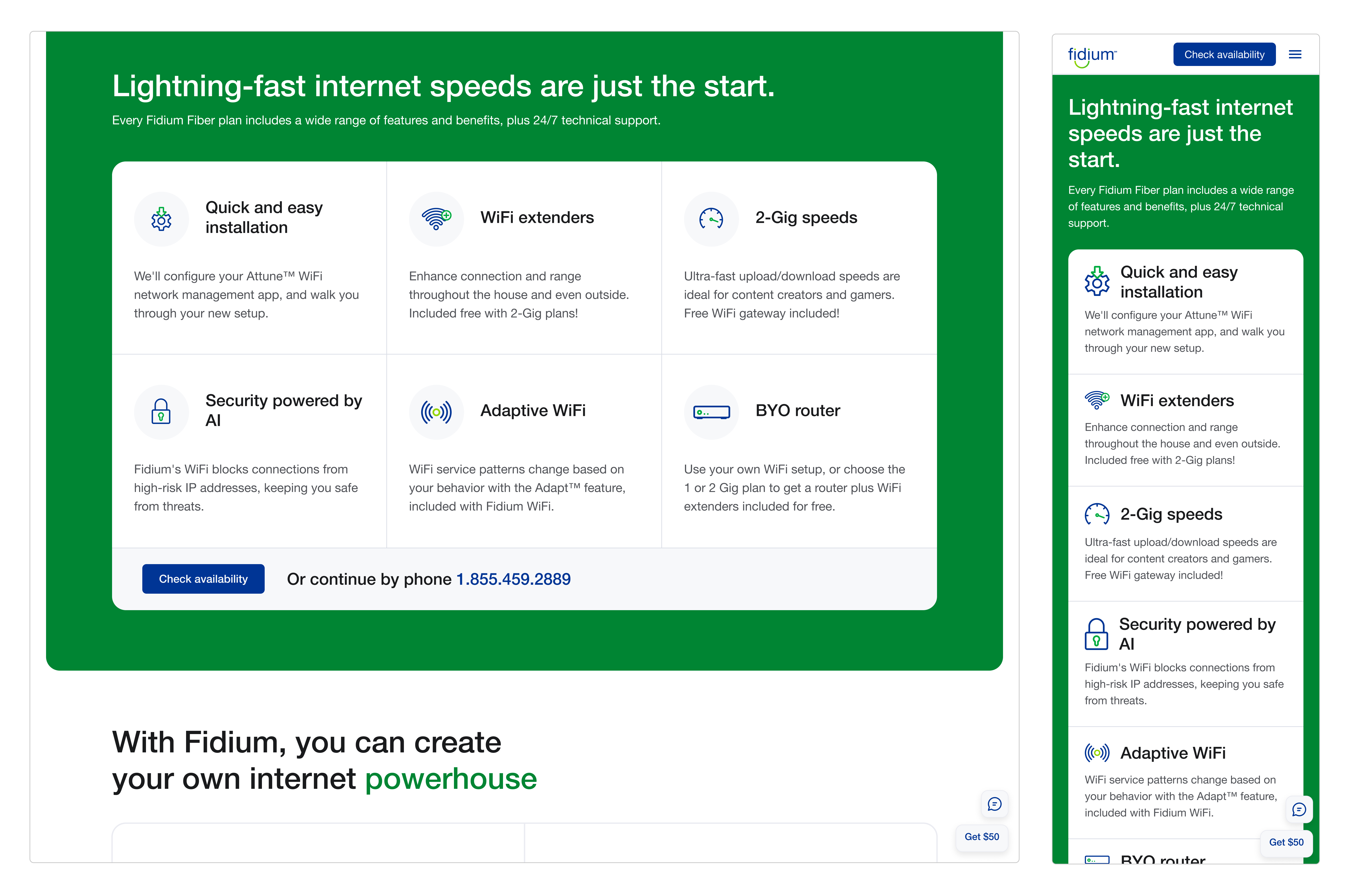
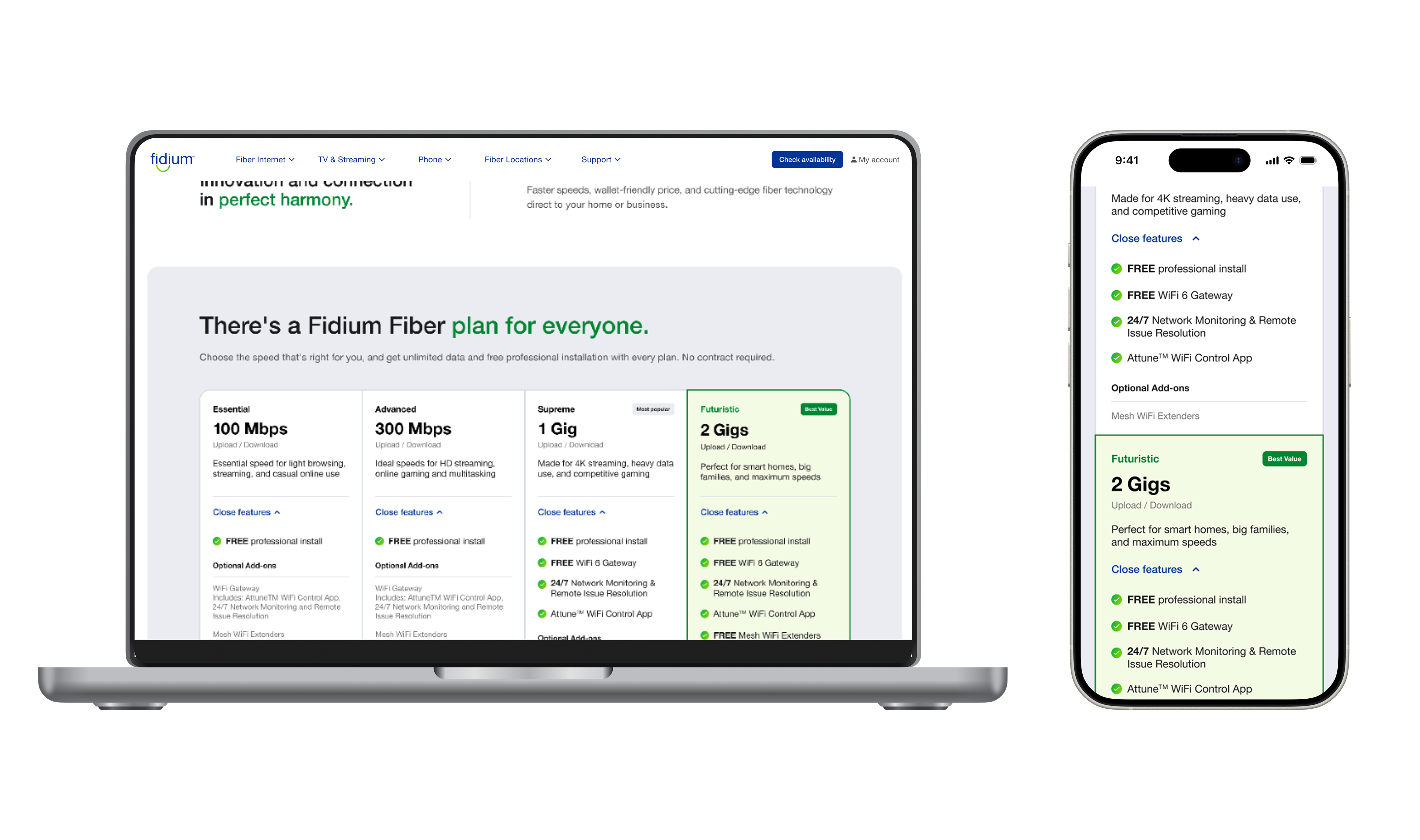
The redesigned landing pages introduced a clearer content hierarchy, simplified navigation, and more focused messaging to guide users through key actions, like exploring plans, managing services, and accessing support. By aligning each page to specific customer needs, the new experience improves usability, reduces confusion, and encourages ongoing engagement with Fidium’s services. View live website here ↗
The Process
The Fidium redesign began with a collaborative, insight-driven approach. I worked closely with a cross-functional team to ensure alignment across user needs, business goals, and content strategy.
1. Discovery: Immersion & Planning
We started with an immersion phase to understand Fidium’s brand, audience, and platform objectives. This included reviewing internal documentation, aligning on project goals, and mapping out a phased approach to guide our work.
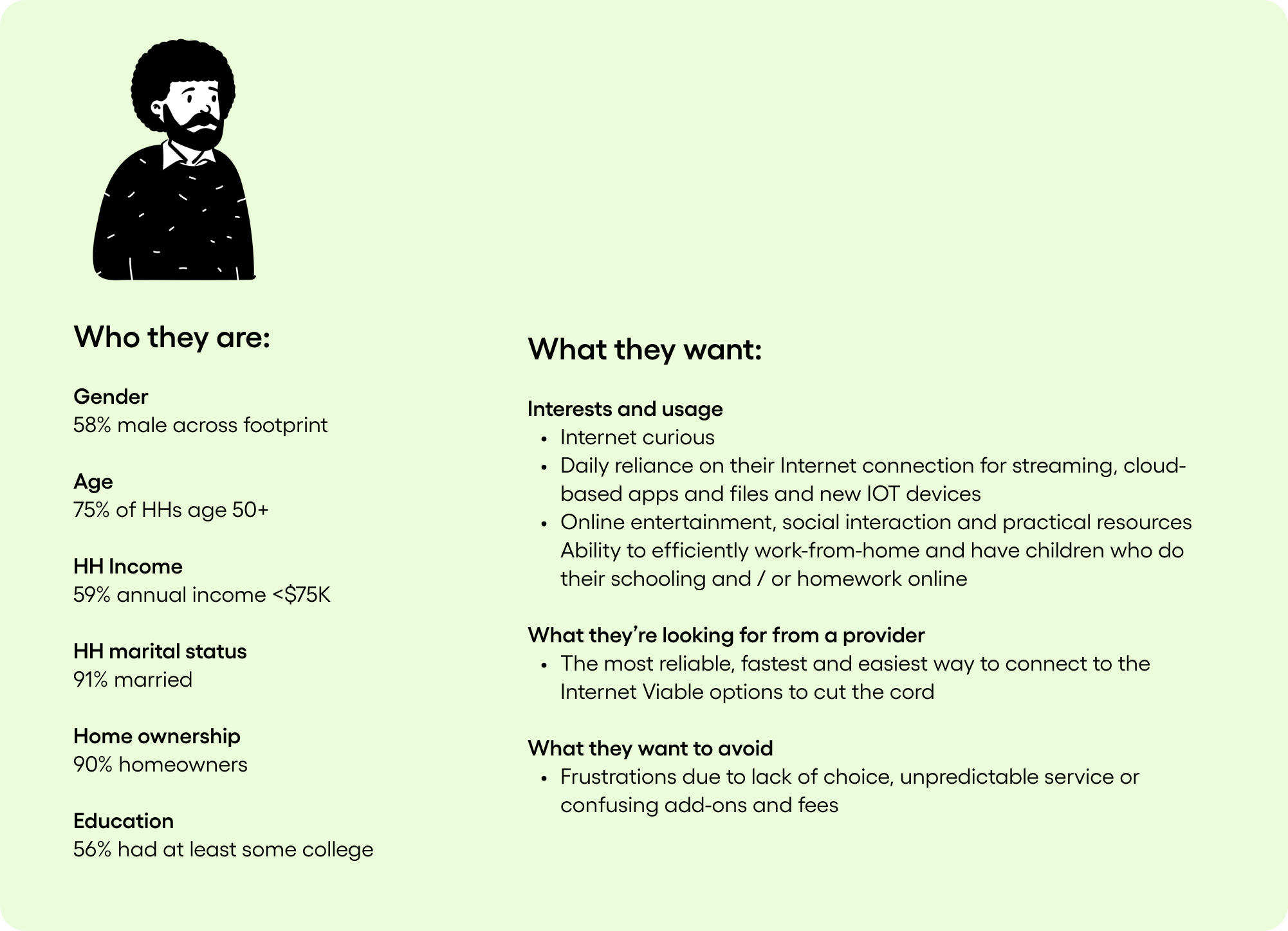
2. Customer & Audience Research
We performed a demographic and behavioral analysis to better understand Fidium’s customer base and usage patterns. This included identifying key user segments, evaluating their service needs, and assessing digital expectations. These insights informed content prioritization, tone of voice, and overall UX strategy for the redesigned pages.
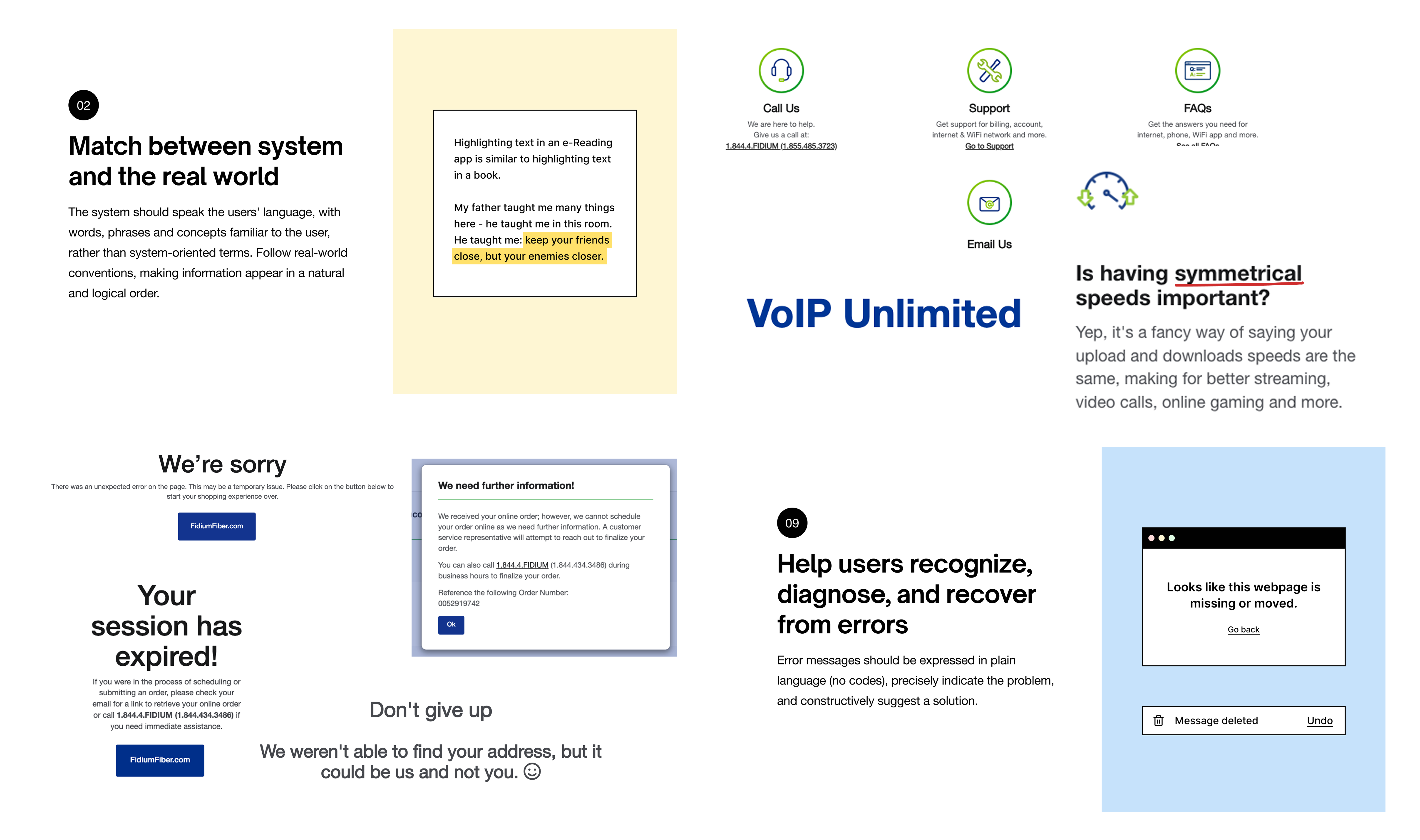
3. Audit & Heuristic Analysis
Next, we conducted a detailed audit and heuristic analysis of the existing landing pages to evaluate usability, visual consistency, and content clarity. This helped surface friction points, gaps in the user journey, and missed communication opportunities.

4. Competitive & Industry Scan
We analyzed competitor websites and adjacent industries to gather inspiration and benchmark best practices. This gave us insight into how others were effectively communicating complex service offerings and driving engagement.


5. Design & Iteration
With a clear understanding of user pain points and strategic goals, I led the design process, creating wireframes and visual concepts that improved hierarchy, streamlined navigation, and focused messaging across the four key landing pages. The copywriter and I worked closely to align content tone and clarity with the new design direction.

Results
The redesigned Fidium website delivered a cleaner, more intuitive experience that better reflects the brand’s modern identity. Early feedback indicated stronger customer engagement, and the streamlined content hierarchy helped reduce confusion and guide visitors toward key actions. The enhanced product showcase functionality also positioned Fidium’s offerings more clearly, supporting both lead generation and ongoing customer satisfaction.
Final Thoughts
This project demonstrated the impact of thoughtful design on usability and business goals. By prioritizing clarity, accessibility, and user-centered navigation, the redesign created a more cohesive and customer-friendly digital experience. With development successfully executed by Fidium’s internal team and the site launch following shortly after, the project stands as a strong example of how collaborative design and execution can deliver measurable improvements to both brand perception and user engagement.