Mobile Experience for the Modern Employee
Redesigned PlanSource as a white-label PWA that boosted engagement 20%, reduced dev time 3×, and scaled across thousands of employers.
A market leader with an engagement problem
PlanSource is a leading cloud-based benefits administration platform serving over 2 million employees across hundreds of enterprise clients. As a white-label solution, the platform lets companies of all sizes give their employees benefits enrollment and management under their own branding.
Despite its market leadership, PlanSource faced a critical challenge: its mobile experience drove minimal engagement outside of annual open enrollment, creating frustration for employees and increasing administrative costs for HR teams.
Employees were disconnected from their benefits for 49 weeks a year
Analytics revealed a stark reality: 78% of employees only accessed the benefits platform during the 2–3 week open enrollment period, with engagement dropping sharply afterward, exactly when employees needed the information most.
Why this mattered:
- ✧ Employees couldn't quickly access benefit details when visiting doctors, pharmacies, or dealing with life events
- ✧ Simple questions ("What's my deductible?" "Is this covered?") required calling HR or digging through enrollment emails
- ✧ Unused benefits represented wasted employer investment: companies paying for perks employees forgot they had
Three groups, three sets of pain
Through stakeholder interviews and platform analytics, three distinct user groups emerged with critical pain points:
Employees (Primary Users)
- ✧ Fragmented experience: actions like accessing an ID card or editing beneficiaries required navigating multiple confusing menus
- ✧ Low engagement: employees rarely revisited the platform, even for critical life events
- ✧ Frustration: routine tasks often required reaching out to HR
HR & Employers (Secondary Users)
- ✧ Operational overhead: HR handled hundreds of routine requests, pulling time from strategic work
- ✧ Onboarding burden: new employees struggled to understand benefits options without extensive HR support
For PlanSource
- ✧ High maintenance costs: multiple codebases and inconsistent design systems increased engineering overhead
- ✧ Slow time-to-market: rolling out new features across clients was resource-intensive
- ✧ Competitive risk: without stronger engagement, PlanSource risked falling behind more user-friendly benefit platforms
"When I can't find my ID card, I just call HR. It's faster than logging in."
Employee interview
How might we...
- ✧ Streamline benefits management into a simple, intuitive, mobile-first platform?
- ✧ Enable employees to self-serve common actions like ID cards, beneficiaries, and plan comparisons?
- ✧ Build a scalable, white-label system that reduces maintenance and accelerates rollout across clients?
- ✧ Boost engagement beyond open enrollment and position PlanSource as a year-round benefits partner?
A white-labeled PWA that streamlined employee benefits administration by offering highly accessible, intuitive self-service, directly via any web browser, reducing HR burden and enhancing communication.
From discovery to a shipped design system
Discovery & Audit
- ✧ Interviewed HR admins and employees to map workflows
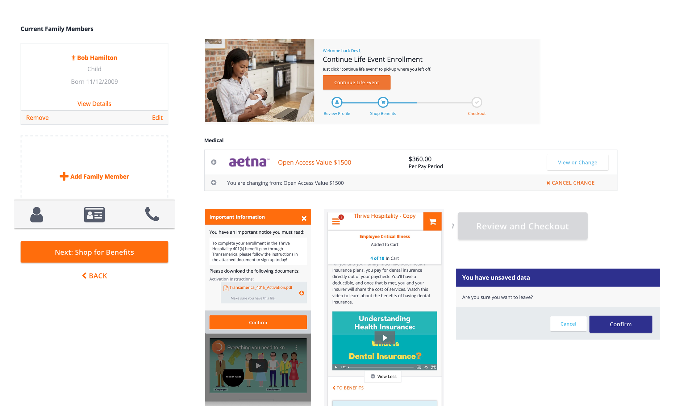
- ✧ Identified high-friction tasks: ID cards, beneficiary updates, plan comparison
- ✧ Audited existing flows: multi-step, desktop-biased, not mobile-friendly
Synthesis
Mapped the employee journey and identified moments of frustration:
- ✧ Life events (marriage, new baby) requiring quick beneficiary updates
- ✧ Urgent care visits where employees needed ID cards immediately
- ✧ Comparing plans without clear side-by-side information
System Design
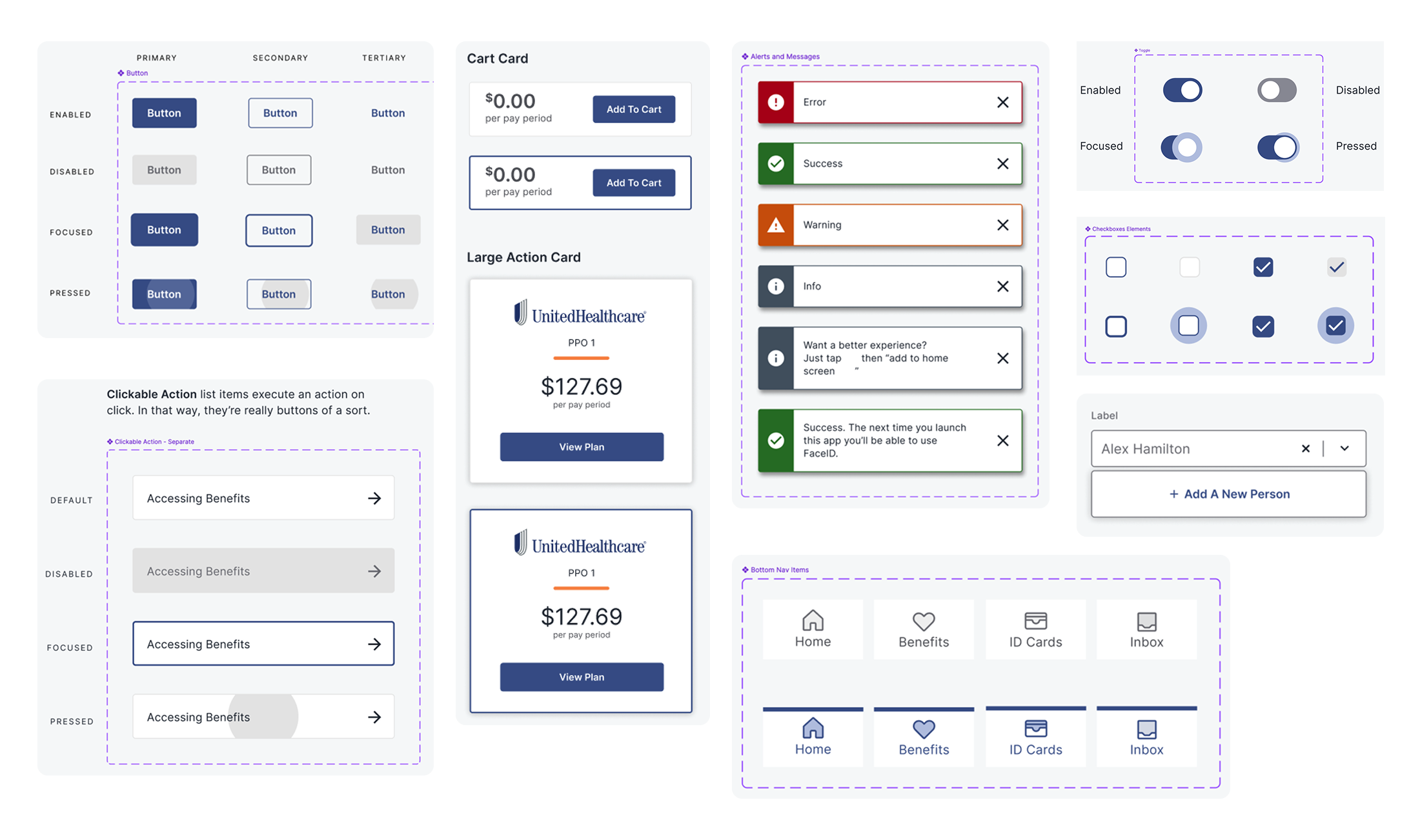
- ✧ Built a scalable design system in Figma, optimized for white-labeling
- ✧ Established component libraries for dashboards, cards, and data tables
- ✧ Documented accessibility and responsive design standards
Feature Prioritization
Collaborated with stakeholders to focus on four core features:
Personalized Enrollment & Dashboard
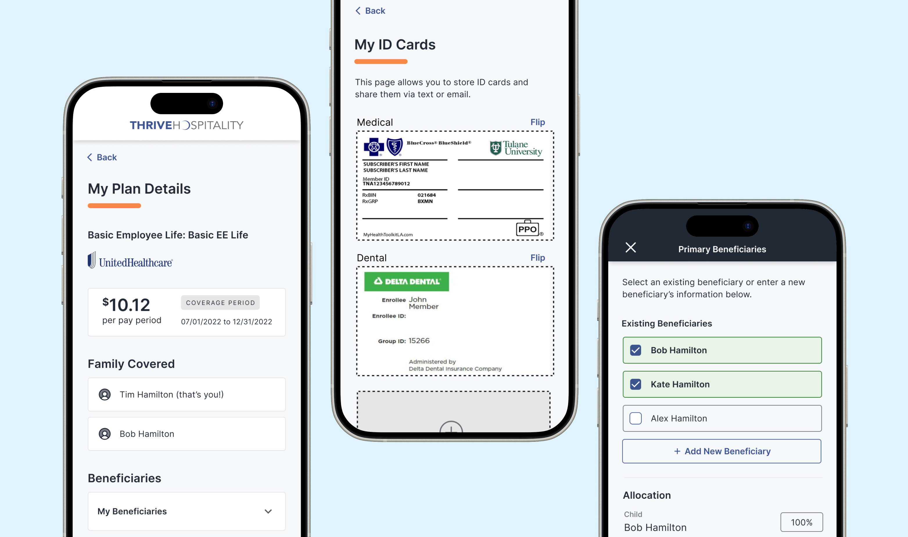
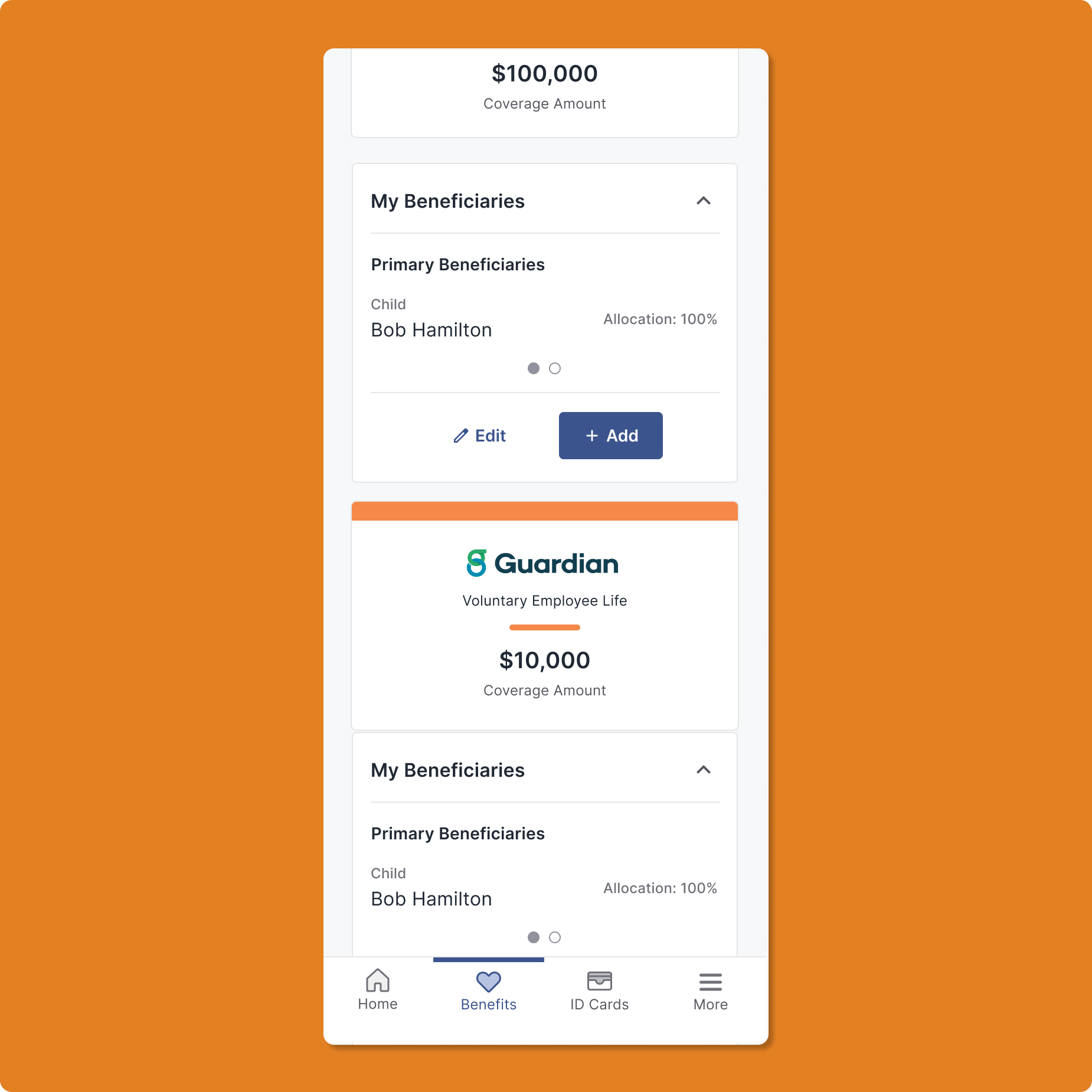
A homepage to-do list showing enrollment progress with a direct call to action, plus card-based navigation to "My Benefits," "My Inbox," "My Paycheck," and "My Company."
Transparent Medical Plan Details
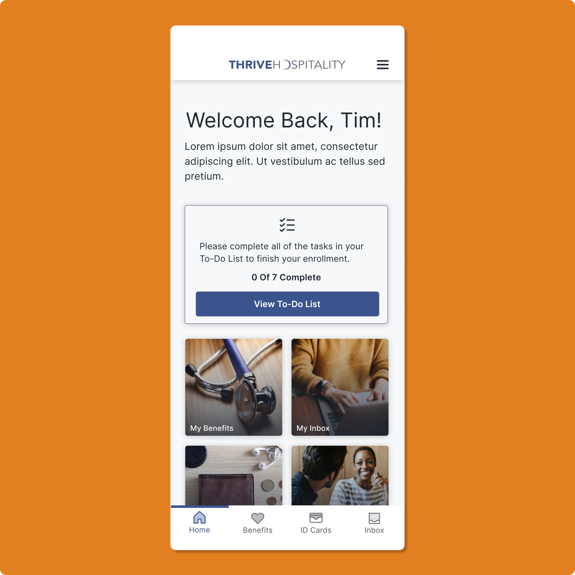
An at-a-glance view of an employee's medical coverage: plan name, carrier, per-pay-period cost, and active coverage dates, on a single screen.
Simplified Beneficiary Management
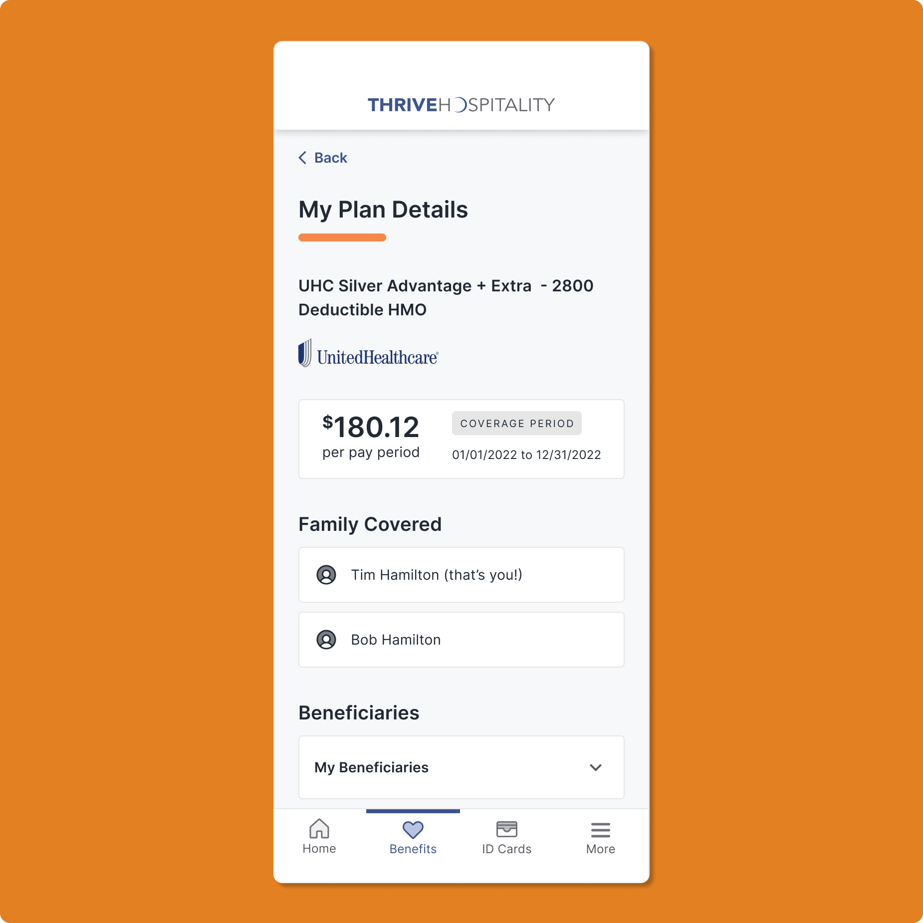
Users can view, edit, and add primary beneficiaries with clear allocation percentages, simplifying a crucial and often confusing part of benefits planning.
Digital ID Cards & Easy Sharing
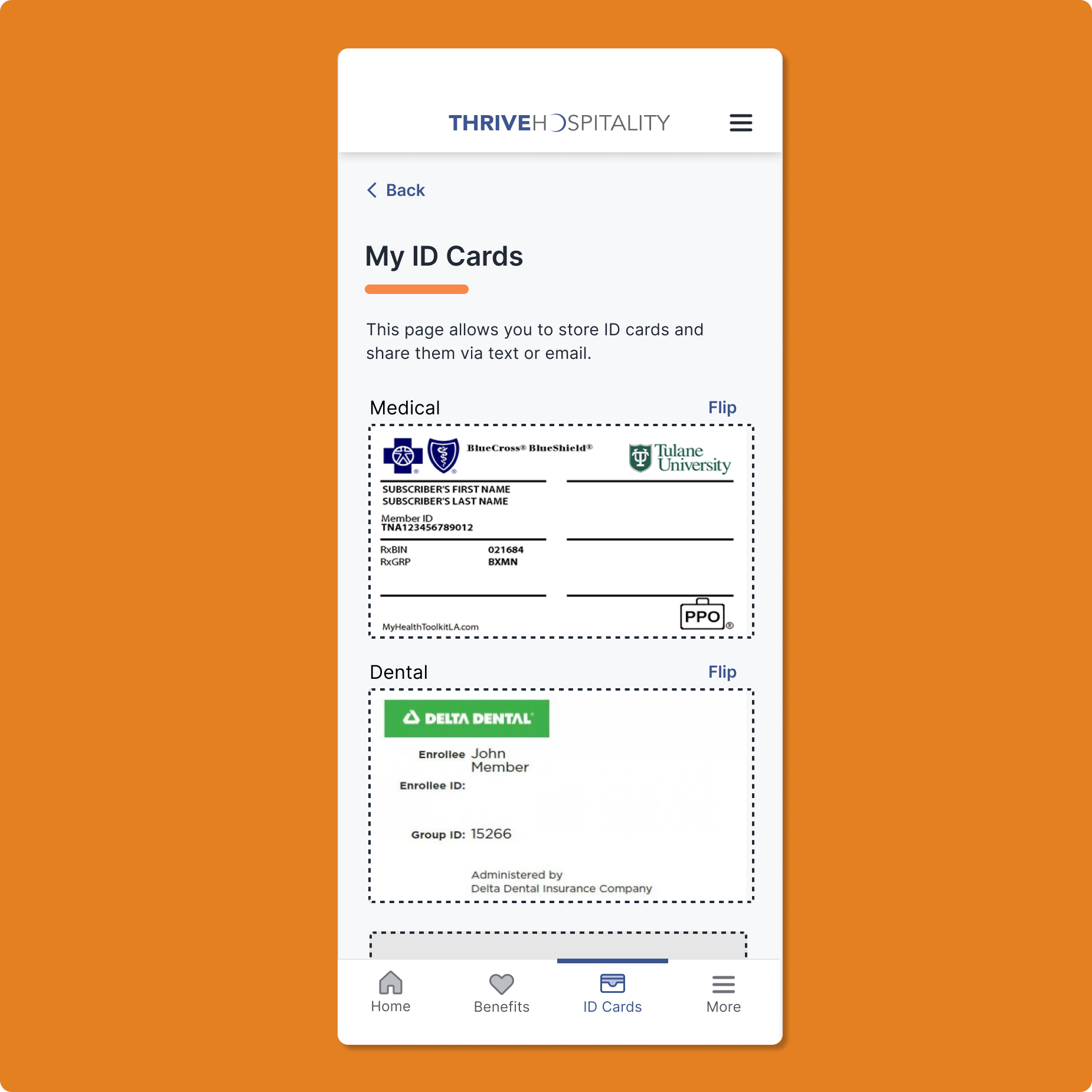
Instant sharing via text or email, with a "flip" for back-of-card details, eliminating the need for physical cards.
Validating with real users before launch
Objectives were to gather qualitative data on new and existing features, validate UI components, assess the overall design direction, and understand the clarity of user flows and navigation. Initial KPIs tracked:
- ✽ Reduced time allocated per client account by Account Managers, and increased account allocation per manager
- ✽ Increased client satisfaction with open enrollment setup
- ✽ Increased client satisfaction with Account Manager responsiveness to challenges
Key takeaways
- UI patterns and navigation matched users' expectations for a mobile experience
- Information was organized effectively and easy to find
- Users found value in returning to the app after enrollment closed
What shipped
- ✧ Personalized dashboard: a year-round hub with quick-access cards for top tasks
- ✧ One-tap digital ID cards: always available, even offline; reduced HR calls
- ✧ Simplified beneficiary management: step-by-step flows minimized errors
- ✧ Mobile-friendly plan comparison: responsive tables with plain-language details
- ✧ White-label design system: reusable components cut dev cycles significantly
Results across employees, HR, and engineering
Employee Engagement
+20% increase in traffic outside open enrollment
NPS +53, the highest in the company's history
HR & Employer Efficiency
Significant reduction in routine HR calls (ID cards, beneficiary updates)
Faster onboarding, fewer support tickets
Engineering & Business Outcomes
3× faster feature development with a unified codebase and design system
40% less maintenance overhead across client deployments
A scalable PWA rolled out to thousands of employers
What this project taught me
Mobile-first thinking forced ruthless prioritization of critical information, creating clarity across all screen sizes. Task-based navigation aligned with users' mental models, making the platform immediately intuitive.
The design system was a force multiplier. Upfront investment in accessible, reusable components accelerated delivery and ensured consistency across every white-labeled client.
Designing my first PWA meant learning to balance multiple contexts at once: offline usage, app-like interactions without native capabilities, true responsiveness, and WCAG AA accessibility. I had to rethink fundamental patterns: what happens when users lose connectivity? Which features work offline versus connected? Those questions pushed me toward offline-first design that progressively enhanced.